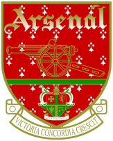
Unveiled in 1888, Royal Arsenal's first crest featured three cannons viewed from above, pointing northwards, similar to the coat of arms of the Metropolitan Borough of Woolwich. These can sometimes be mistaken for chimneys, but the presence of a carved lion's head and a cascabel on each are clear indicators that they are cannons. This was dropped after the move to Highbury in 1913, only to be reinstated in 1922, when the club adopted a crest featuring a single cannon, pointing eastwards, with the club's nickname, The Gunners, inscribed alongside it; this crest only lasted until 1925, when the cannon was reversed to point westward and its barrel slimmed down. In 1949, the club unveiled a modernised crest featuring the same style of cannon below the club's name, set in blackletter, and above the coat of arms of the Metropolitan Borough of Islington and a scroll inscribed with the club's newly-adopted Latin motto, Victoria Concordia Crescit "victory comes from harmony", coined by the club's programme editor Harry Homer. For the first time, the crest was rendered in colour, which varied slightly over the crest's lifespan, finally becoming red, gold and green.
Because of the numerous revisions of the crest, Arsenal were unable to copyright it. Although the club had managed to register the crest as a trademark, and had fought (and eventually won) a long legal battle with a local street trader who sold "unofficial" Arsenal merchandise, Arsenal eventually sought a more comprehensive legal protection. Therefore, in 2002 they introduced a new crest featuring more modern curved lines and a simplified style, which was copyrightable.The cannon once again faces east and the club's name is written in a sans-serif typeface above the cannon. Green was replaced by dark blue. The new crest was criticised by some supporters; the Arsenal Independent Supporters' Association claimed that the club had ignored much of Arsenal's history and tradition with such a radical modern design, and that fans had not been properly consulted on the issue.
Until the 1960s, a badge was worn on the playing shirt only for high-profile matches such as FA Cup finals, usually in the form of a monogram of the club's initials in red on a white background.
The monogram theme was developed into an Art Deco-style badge on which the letters A and C framed a football rather than the letter F, the whole set within a hexagonal border. This early example of a corporate logo, introduced as part of Herbert Chapman's rebranding of the club in the 1930s, was used not only on Cup Final shirts but as a design feature throughout Highbury Stadium, including above the main entrance and inlaid in the floors. From 1967, a white cannon was regularly worn on the shirts, until replaced by the club crest, sometimes with the addition of the nickname "The Gunners", in the 1990s.


0 comments:
Post a Comment